Data Visualization
Contents
![]()
Data Visualization
This tutorial was inspired by and adapted from Shawn A. Rhoads’ PSYC 347 Course [CC BY-SA 4.0 License].
Learning objectives
This notebook is intended to teach you basic python syntax for:
Histograms
Bar plots
Point plots
Violin plots
Scatter plots
Two packages will be used for data visualization: matplotlib and seaborn. matplotlib is a very powerful and flexible plotting package, but it can be a bit cumbersome to use. seaborn is a package that is built on top of matplotlib and makes it easier to create beautiful plots. We will use seaborn for most of our plotting needs.
Histograms
In the last module, we viewed the distributions of variables using the value_counts() method. We can also use histogram plots to accomplish this task. Histograms are useful for visualizing the distribution of a single variable. The x-axis of a histogram is the range of values for the variable, and the y-axis is the frequency of occurrence for each value.
To plot a histogram, we will use the distplot() function from the seaborn package. The distplot() function takes a single variable as input and plots a histogram of that variable. Let’s plot a histogram of the “Age” variable from the Banker et al. (2022) dataset.
# First let's import some packages
import pandas as pd              # we will import the pandas package and call it pd
import matplotlib.pyplot as plt  # we will import the pyplot module from matplotlib package and call it plt
import seaborn as sns            # we will import the seaborn package and call it sns
# let's read the data from the csv file (we will use the clean version that we created in the previous module)
our_data = pd.read_csv('https://raw.githubusercontent.com/Center-for-Computational-Psychiatry/course_spice/main/modules/resources/data/Banker_et_al_2022_QuestionnaireData_clean.csv')
# Now we will plot a histogram of the age of the participants
ax = sns.distplot(our_data['Age'], kde=False)

# we can also add a title and labels to the axes
ax.set_title('Age of participants')
ax.set_xlabel('Age')
ax.set_ylabel('Number of participants')

# we can also tidy up some more by removing the top and right spines
sns.despine()

# we will use the `show()` function to plot within the notebook
plt.show()
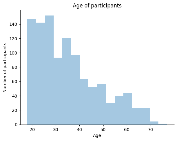
As we remarked in the last module, we have a pretty young sample! How about we plot the mean on the histogram too?
We can use the axvline() function from matplotlib to plot a vertical line at the mean of the distribution. The axvline() function takes the mean of the distribution as input. We can get the mean of the distribution using the mean() method.
# Now we will plot a histogram of the age of the participants
ax = sns.distplot(our_data['Age'], kde=False)

# we can also add a title and labels to the axes
ax.set_title('Age of participants')
ax.set_xlabel('Age')
ax.set_ylabel('Number of participants')

# we can also tidy up some more by removing the top and right spines
sns.despine()

# add a vertical line to show the Mean age
ax.axvline(our_data['Age'].mean(), color='red', linestyle='--')

# we will use the `show()` function to plot within the notebook
plt.show()
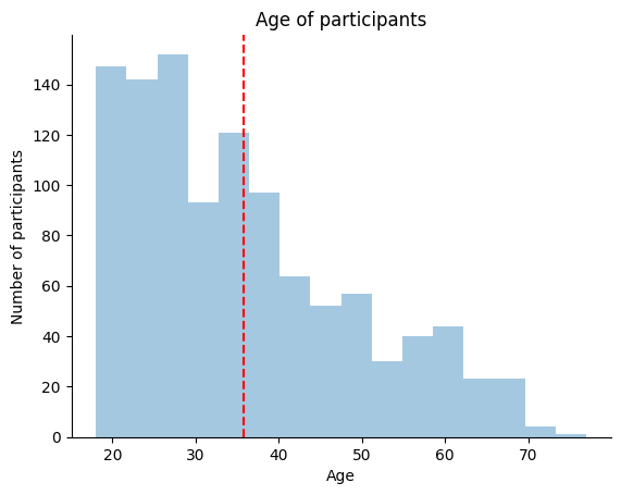
The mean might not be the best summary statistic for our data since “Age” is so skewed. Let’s also plot the median on the histogram. We can use the axvline() function again, but this time we will use the median() method to get the median of the distribution.
# Now we will plot a histogram of the age of the participants
ax = sns.distplot(our_data['Age'], kde=False)

# we can also add a title and labels to the axes
ax.set_title('Age of participants')
ax.set_xlabel('Age')
ax.set_ylabel('Number of participants')

# we can also tidy up some more by removing the top and right spines
sns.despine()

# add a vertical line to show the Mean age
ax.axvline(our_data['Age'].mean(), color='red', linestyle='--')

# add a vertical line to show the Median age
ax.axvline(our_data['Age'].median(), color='black', linestyle='-')

# we will use the `show()` function to plot within the notebook
plt.show()
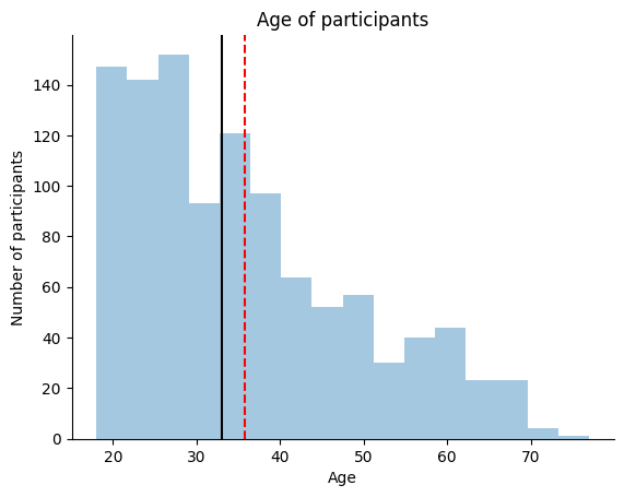
We can see that the median is a better summary statistic for our data than the mean. The median is a more robust summary statistic than the mean because it is less sensitive to outliers.
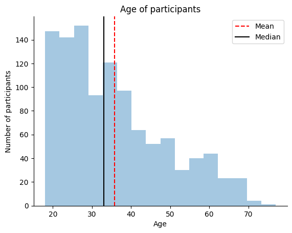
However, based on this plot alone it would be tough for anyone else reading the plot to know what the mean and median are. Let’s add a legend to the plot to make it easier for others to interpret.
# Now we will plot a histogram of the age of the participants
ax = sns.distplot(our_data['Age'], kde=False)

# we can also add a title and labels to the axes
ax.set_title('Age of participants')
ax.set_xlabel('Age')
ax.set_ylabel('Number of participants')

# we can also tidy up some more by removing the top and right spines
sns.despine()

# add a vertical line to show the Mean age
ax.axvline(our_data['Age'].mean(), color='red', linestyle='--')

# add a vertical line to show the Median age
ax.axvline(our_data['Age'].median(), color='black', linestyle='-')

# add a legend for our lines
ax.legend(['Mean', 'Median'])

# we will use the `show()` function to plot within the notebook
plt.show()
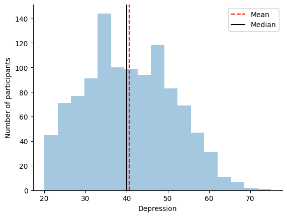
We can also plot the histogram of one of our other psychiatric variables. Let’s plot a histogram of Depression.
# Now we will plot a histogram of the age of the participants
ax = sns.distplot(our_data['Depression'], kde=False)

# we can also add a title and labels to the axes
ax.set_xlabel('Depression')
ax.set_ylabel('Number of participants')

# we can also tidy up some more by removing the top and right spines
sns.despine()

# add a vertical line to show the Mean age
ax.axvline(our_data['Depression'].mean(), color='red', linestyle='--')

# add a vertical line to show the Median age
ax.axvline(our_data['Depression'].median(), color='black', linestyle='-')

# add a legend for our lines
ax.legend(['Mean', 'Median'])

# we will use the `show()` function to plot within the notebook
plt.show()
Bar plots
Bar plots are useful for visualizing the distribution of a categorical variable. The x-axis of a bar plot is the categories of the variable, and the y-axis is the frequency of occurrence for each category.
We can use a bar plot to look at our distribution of “Sex” in our sample. We will use the countplot() function from seaborn to plot a bar plot. The countplot() function takes a single variable as input and plots a bar plot of that variable.
# Plot a bar plot of Sex of participants
ax = sns.countplot(x='Sex', data=our_data)

# we can also add a title and labels to the axes
ax.set_title('Sex of participants')
ax.set_xlabel('Sex')
ax.set_ylabel('Number of participants')

# we can also tidy up some more by removing the top and right spines
sns.despine()

# we will use the `show()` function to plot within the notebook
plt.show()
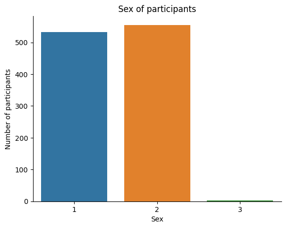
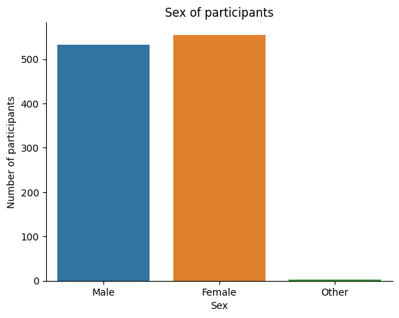
Sometimes, the labels for a variable will be coded (for example, in our dataset, 1=Male, 2=Female, 3=Other) and thus not accessible to someone who is not familiar with the data. There are two solutions to this.
First, we can change the labels manually after plotting. We will use the set_xticklabels() method to change the xticklabels. The set_xticklabels() method takes a list of strings as input and changes the xticklabels to the strings in the list. We will use the xticklabels argument to specify the list of strings.
# Plot a bar plot of Sex of participants
ax = sns.countplot(x='Sex', data=our_data)

# we can also add a title and labels to the axes
ax.set_title('Sex of participants')
ax.set_xlabel('Sex')
ax.set_ylabel('Number of participants')

# Let's change the xticklabels (we know the order already from the previous plot, so we can just use a list)
ax.set_xticklabels(['Male', 'Female', 'Other'])

# we can also tidy up some more by removing the top and right spines
sns.despine()

# we will use the `show()` function to plot within the notebook
plt.show()

Alternatively, we can change them in the dataframe directly before plotting. To do this, we will use the replace() method. The replace() method takes a dictionary as input and replaces the keys in the dictionary with the values in the dictionary. We will use the inplace argument to specify that we want to change the values in the dataframe directly.
# Change the labels for Sex to be more descriptive
our_data['Sex'].replace({1:'Male', 2:'Female', 3:'Other'}, inplace=True)

# Plot a bar plot of Sex of participants
ax = sns.countplot(x='Sex', data=our_data)

# we can also add a title and labels to the axes
ax.set_title('Sex of participants')
ax.set_xlabel('Sex')
ax.set_ylabel('Number of participants')

# we can also tidy up some more by removing the top and right spines
sns.despine()

# we will use the `show()` function to plot within the notebook
plt.show()
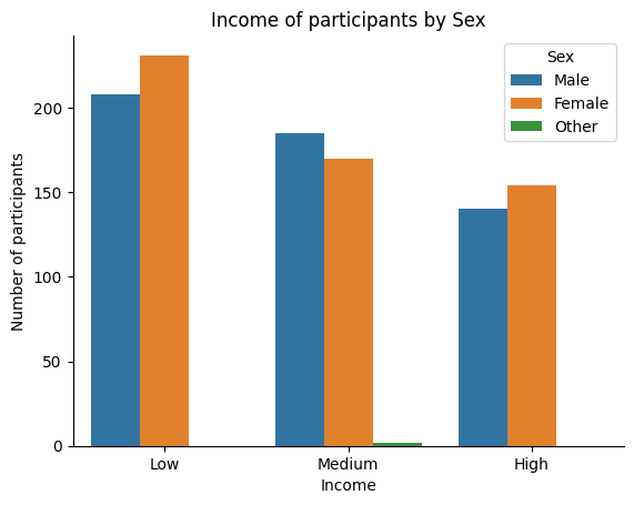
We can also plot the frequencies of two categorical variables at the same time. We can accomplish this using the barplot() function from seaborn and including the hue flag. The hue flag takes a categorical variable as input and plots the distribution of the first variable for each category of the second variable.
Let’s plot the counts of Sex for each of our Income groups (which we created in the previous module).
ax = sns.countplot(x='IncomeSplit', hue='Sex', data=our_data)

# we can also add a title and labels to the axes
ax.set_title('Income of participants by Sex')
ax.set_xlabel('Income')
ax.set_ylabel('Number of participants')

# change legend title
ax.legend(title='Sex')

# we can also tidy up some more by removing the top and right spines
sns.despine()

# we will use the `show()` function to plot within the notebook
plt.show()
Point plots
Point plots are useful for visualizing the relationship between two categorical variables. The x-axis of a point plot is the categories of one variable, and the y-axis is the mean of the second variable for each category.
We can use the point plot to look at one of our measures as a function of Depression. Let’s see how Loneliness changes with Depression symptoms. We will use the pointplot() function from seaborn to plot a point plot. The pointplot() function takes two variables as input and plots a point plot of the first variable as a function of the second variable.
# Let's create a new variable called `DepressionGroups` with two age groups: Low and High
our_data['DepressionGroups'] = pd.cut(our_data['Depression'], 2, labels=['Low', 'High'])

# Plot a pointplot of Mean Loneliness as a function of Depression Groups
ax = sns.pointplot(x='DepressionGroups',
                   y='Loneliness',
                   data=our_data)

# we can also add a title and labels to the axes
ax.set_title('Mean Loneliness as a function of Depression')
ax.set_xlabel('Depression')
ax.set_ylabel('Mean Loneliness')

# we can also tidy up some more by removing the top and right spines
sns.despine()

# we will use the `show()` function to plot within the notebook
plt.show()
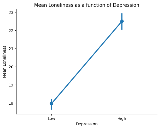
Younger people appear to be slightly lonelier than older people in our sample.
The pointplot is informative because it shows us the mean of the second variable (Loneliness) for each category of the first variable (Age). However, it only depicts the mean and confidence intervals. We are missing information about the distribution of the Loneliness for each Age group, which is informative when comparing groups.
Violin plots
Our solution to this is to use a violin plot. Violin plots are useful for visualizing the relationship between a categorical variable and a continuous variable. The x-axis of a violin plot is the categories of the categorical variable, and the y-axis is the distribution of the continuous variable for each category (this is similar to the histogram plots from above).
Let’s plot our variables again using a violin plot. We will use the violinplot() function from seaborn to plot a violin plot. The violinplot() function takes two variables as input and plots a violin plot of the first variable as a function of the second variable.
# Plot a pointplot of Mean Loneliness as a function of Depression Groups
ax = sns.violinplot(x='DepressionGroups',
                   y='Loneliness',
                   data=our_data)

# we can also add a title and labels to the axes
ax.set_title('Loneliness as a function of Depression')
ax.set_xlabel('Depression')
ax.set_ylabel('Loneliness')

# we can also tidy up some more by removing the top and right spines
sns.despine()

# we will use the `show()` function to plot within the notebook
plt.show()
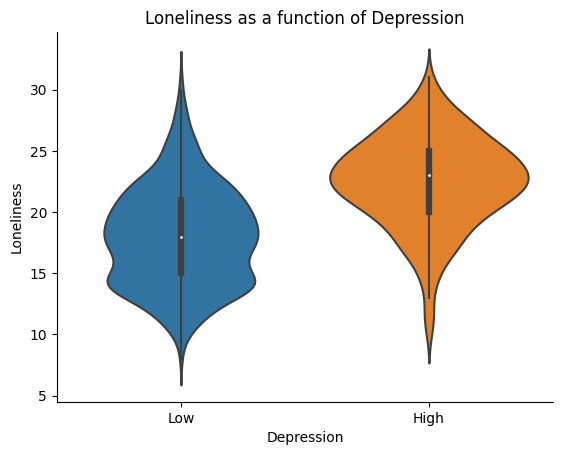
Notice how the violin plot shows us the distribution of Loneliness for each Depression group.
Scatter plots
The pointplot and violin plots still lack some information about the individual participants in our sample. Because we collected participants’ Depression symptoms as a continuous measure, we can push our limits from the previous two plots and look at the continous relationship between Loneliness and Depression. We can use a scatter plot to visualize the relationship between two continuous variables. The x-axis of a scatter plot is one continuous variable, and the y-axis is the other continuous variable.
We will use the scatterplot() function from seaborn to plot a scatter plot. The scatterplot() function takes two variables as input and plots a scatter plot of the first variable as a function of the second variable.
# Plot a pointplot of Mean Loneliness as a function of Depression
ax = sns.scatterplot(x='Loneliness',
                     y='Depression',
                     data=our_data)

# we can also add a title and labels to the axes
ax.set_title('Loneliness as a function of Depression')
ax.set_xlabel('Depression')
ax.set_ylabel('Loneliness')

# we can also tidy up some more by removing the top and right spines
sns.despine()

# we will use the `show()` function to plot within the notebook
plt.show()
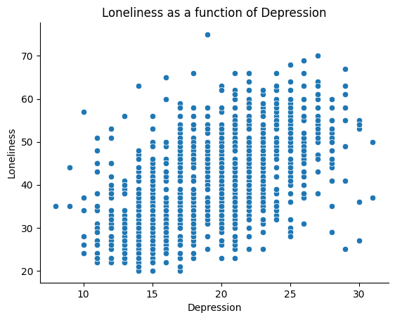
We can now view the entire relationship between Loneliness and Depression. Each dot on this plot represents one person. We can see that there is a positive relationship between Loneliness and Depression. This means that as Loneliness increases, Depression also increases. (Remember, we cannot make any causal claims about this relationship here. People who are more depressed could become more lonely or people who are more lonely could become more depressed.)
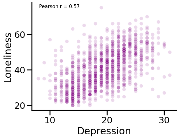
We can also stylize our figure aesthetics a bit more. Here are some things that we can do to make our plots more readable:
Change the opacity of the dots, which will provide a better idea of the frequency of overlapping values: We can use the
alphaargument to change the opacity of the dots. Thealphaargument takes a number between 0 and 1 as input and changes the opacity of the dots to that number.Change the color of the dots: We can use the
colorargument to change the color of the dots. Thecolorargument takes a color name as input and changes the color of the dots to that color.Change the size of the dots: We can use the
sargument to change the size of the dots. Thesargument takes a number as input and changes the size of the dots to that number.Add an annotation of the correlation between these variables: We can use the
annotate()function frommatplotlibto add an annotation to our plot. Theannotate()function takes a string as input and adds the string to the plot.Set a predefined style for our plot (I like
sns.set_context("poster")). We can use theset_context()function fromseabornto set a predefined style for our plot. Theset_context()function takes a string as input and sets the style of the plot to the style specified by the string.
# change the style
sns.set_context('poster')

# Plot a pointplot of Mean Loneliness as a function of Depression
ax = sns.scatterplot(x='Loneliness',
                     y='Depression',
                     s=75,            # set size of points to 50
                     alpha=0.15,      # set opacity to 0.15
                     color='purple',  # set color to purple
                     data=our_data)

# we can also add a title and labels to the axes
ax.set_xlabel('Depression')
ax.set_ylabel('Loneliness')

# Compute the correlation between Loneliness and Depression
corr = our_data['Loneliness'].corr(our_data['Depression'], method='pearson')

# Annotation with the correlation in the top left corner with small font size
ax.annotate(f'Pearson r = {corr:.2f}', xy=(0.05, 0.95), xycoords='axes fraction', fontsize=12)

# we can also tidy up some more by removing the top and right spines
sns.despine()

# we will use the `show()` function to plot within the notebook
plt.show()
Creating a grid of subplots
Finally, we can create a 2 x 2 grid of our plots above using the subplots() function from matplotlib. The subplots() function takes two arguments: the number of rows and the number of columns. We will use the figsize argument to specify the size of the figure.
Then, for each subplot, we specify the axes object that we want to plot on. We can do this using the axs object created from our plt.subplots() function.
sns.set_context('poster')

# create a 2x2 grid of subplots
fig, axs = plt.subplots(nrows=2, ncols=2, figsize=(16, 12))

# plot the first subplot
sns.distplot(our_data['Depression'], kde=False, ax=axs[0, 0])
axs[0, 0].set_xlabel('Depression')
axs[0, 0].set_ylabel('Number of participants')
sns.despine(ax=axs[0, 0])
axs[0, 0].axvline(our_data['Depression'].mean(), color='red', linestyle='--')
axs[0, 0].axvline(our_data['Depression'].median(), color='black', linestyle='-')
axs[0, 0].legend(['Mean', 'Median'])

# plot the second subplot
sns.pointplot(x='DepressionGroups', y='Loneliness', data=our_data, ax=axs[0, 1])
axs[0, 1].set_xlabel('Depression')
axs[0, 1].set_ylabel('Mean Loneliness')

# plot the third subplot
sns.violinplot(x='DepressionGroups', y='Loneliness', data=our_data, ax=axs[1, 0])
axs[1, 0].set_xlabel('Depression')
axs[1, 0].set_ylabel('Loneliness')

# plot the fourth subplot
sns.scatterplot(x='Loneliness', y='Depression', s=75, alpha=0.15, color='purple', data=our_data, ax=axs[1, 1])
axs[1, 1].set_xlabel('Depression')
axs[1, 1].set_ylabel('Loneliness')
corr = our_data['Loneliness'].corr(our_data['Depression'])
axs[1, 1].annotate(f'Pearson r = {corr:.2f}', xy=(0.05, 0.95), xycoords='axes fraction', fontsize=12)
sns.despine()

# adjust the spacing between subplots
plt.subplots_adjust(hspace=0.3, wspace=0.3)

# We can also save the figure to a file using the following code:
plt.savefig('loneliness-and-depression-figure.png', dpi=300)
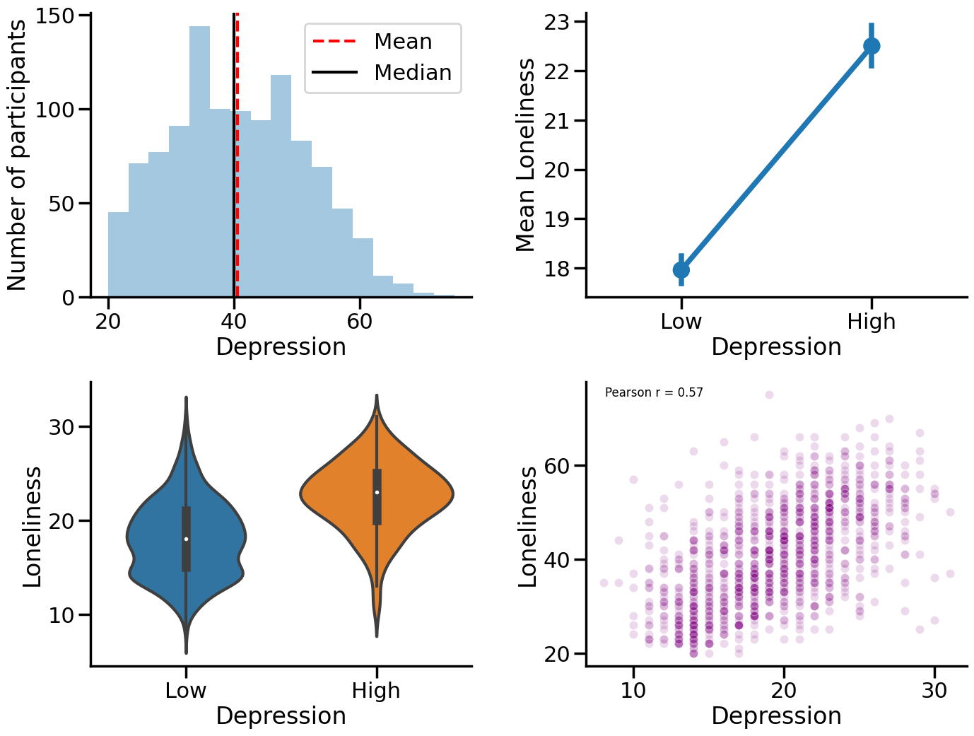
This plot is a combination of four different plots that we have previously created. The first plot is a histogram that shows the number of participants who reported subjective loneliness. The second plot is a point plot that shows the average level of loneliness for different groups of participants who reported different levels of depression. The third plot is a violin plot that shows the distribution of loneliness scores for different groups of participants who reported different levels of depression. The fourth plot is a scatter plot that shows the relationship between loneliness and depression scores for each participant.
Combining plots into a 2x2 grid makes it easier to see how they relate to each other and get a better understanding of the data.
Next steps
Try plotting some other variables!
# Insert your code here
There are so many more things you can do with Seaborn, but this should get you started. If you want to learn more, check out the Seaborn documentation here: https://seaborn.pydata.org/
I also recommend checking out the following resources:
Matplotlib gallery (https://matplotlib.org/gallery/index.html)
Seaborn gallery (https://seaborn.pydata.org/examples/index.html)
The Python Graph Gallery (https://python-graph-gallery.com/)
Visualization with Matplotlib (https://jakevdp.github.io/PythonDataScienceHandbook/04.00-introduction-to-matplotlib.html)
Visualization with Seaborn (https://jakevdp.github.io/PythonDataScienceHandbook/04.14-visualization-with-seaborn.html)